The client
JURNY is an insurance technology company specialising in pay-as-you-go car insurance. By providing solutions based on usage, they are able to offer affordable cover to new drivers who would traditionally have high annual premiums and those drivers that do very low milage or occasional driving.
The brief
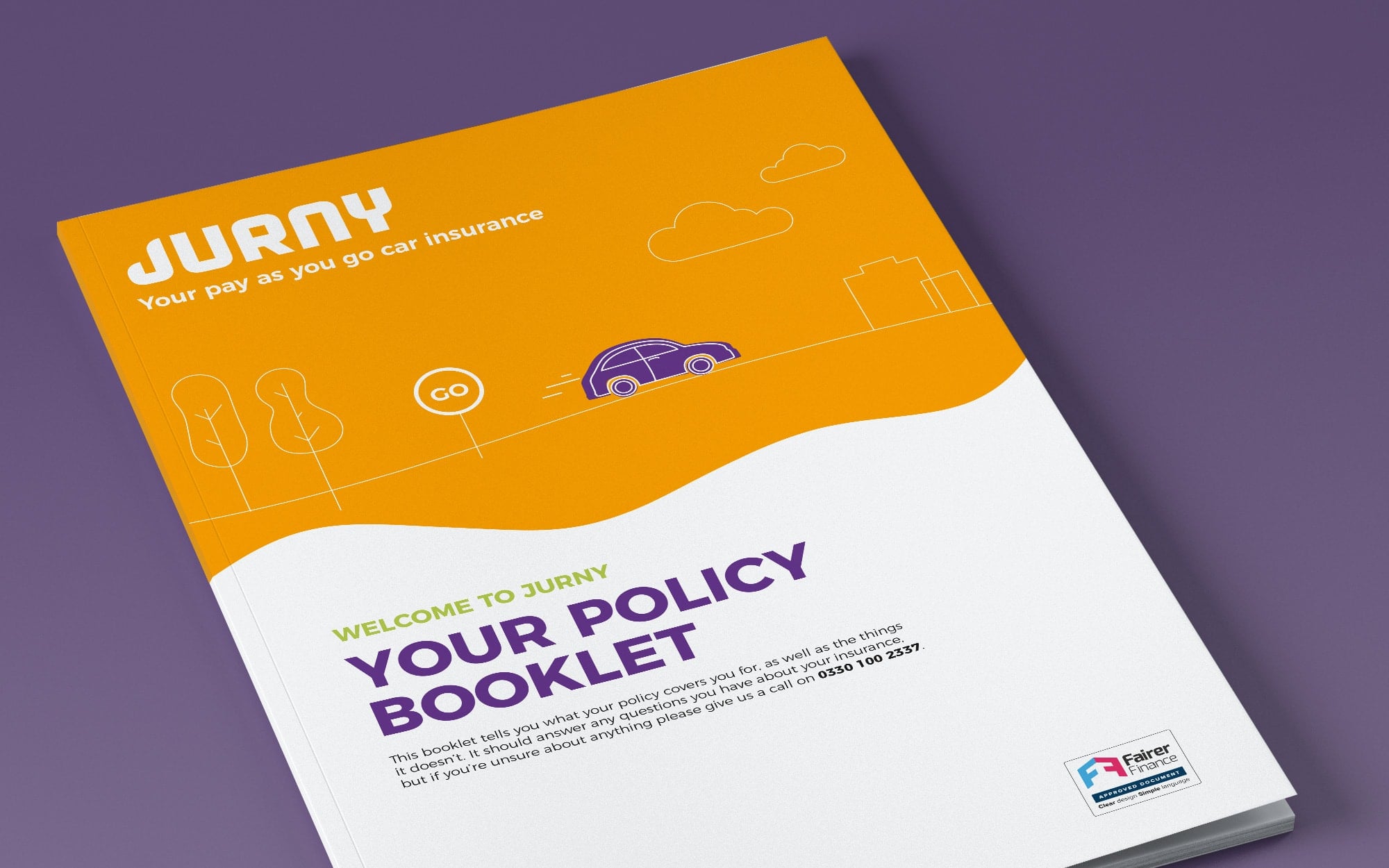
JURNY approached Pre a few months before their formal launch. They were happy with their name and logo, but they didn’t have a brand built around it. They needed a brand and a suite of assets that would set a friendly and approachable tone and would communicate the benefits of their new technology in an easy to understand and approachable format for their customers.
Branding
Illustrations + Iconography
Website Design
Brand Guidelines
Our approach
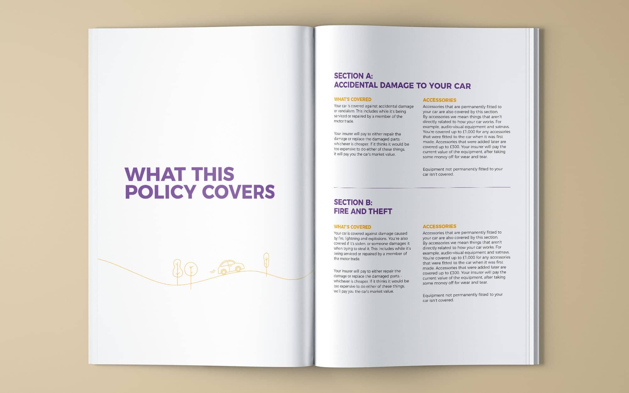
The insurance brand design that we created for JURNY was created with the target audience front of mind at every step of the way. Pay-as-you go insurance is a relatively new offering and so the practicalities and benefits needed to be easily and quickly understood – especially by new drivers who may not have any experience with insurance at all. Creating an open, friendly, approachable and clear brand was therefore more important than ever. We created a clean and clutter-free illustration style for the brand, with a limited palette that is careful not to compete with key information.
The result
JURNY launched with great success. The new brand that we created is clear, strong and instantly recognisible. The brand also offers JURNY huge flexibility for the future through the sizable set of illustration elements that we created as part of the project. These are infinitely adaptable by their internal teams and can be added to for future use. One initial example is the website which we designed and then supplied to JURNY’s team to build and expand on. You can visit JURNY’s website here >


Share this


